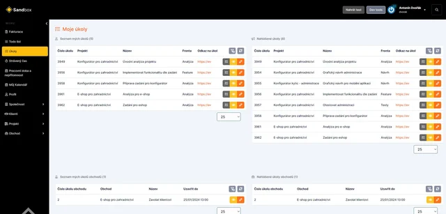
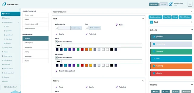
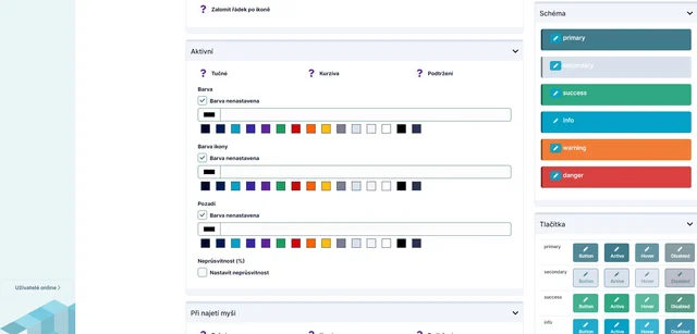
In Systembaker, it is possible to adjust the color scheme of almost the entire system according to the client's needs (e.g., based on their visual identity).
The appearance can be customized for:
In Systembaker, it is possible to adjust the color scheme of almost the entire system according to the client's needs (e.g., based on their visual identity).
Global settings
background color of the page - choose colors from a predefined palette or define your own color by selection or entering the numerical color code.
rounding of corners of frames throughout the system - without rounding or set the desired degree of rounding
Text - setting text for 6 levels of headings, paragraphs, hypertext links:
font size
font
font style
underlining
line spacing
text color
indentation for both inner and outer for text block
for hypertext links, mouseover text properties as well
Color scheme - setting colors for the entire system by defining 6 basic colors for cases:
primary
secondary
success
info
warning
danger
Buttons - defining 6 button styles (primary, secondary, success, info, warning, danger). By default, buttons take on the color from the system's color scheme, but this can be further customized by the user.
Each button state can be set separately:
normal
active
mouseover
disabled
For each button schema and each button state, a range of parameters can be set:
font size
font
font style
underlining
text color
icon color
button color
frame color
button corner rounding
Forms
Systembaker allows defining the appearance of form elements:
text and numeric inputs
password inputs
select boxes
checkboxes
radio buttons
The appearance of form elements can be defined in all states:
normal
active
mouseover
disabled
Properties can be defined for each form element and state:
font size
font
font style
underlining
text color
icon color
background color
frame color of the element
element corner rounding
Tabs - Systembaker allows defining the appearance of two levels of tabs.
The appearance of form elements can be defined in all states:
normal
active
mouseover
Properties can be defined for each tab and state:
font size
font
font style
underlining
text color
background color
frame color of the tab
tab corner rounding
Menu - menu color settings
menu background color
menu item color - font color, icon, and background - for different states (normal, mouseover, click)
font size, font, and font style for menu items - again for different states
button corner rounding of the background for menu items
Logo - Systembaker allows using the client's own logo or other graphical elements (e.g., in the footer of the menu or login screen).